5 hero section tips you can steal from brands like Bloom & Wild, Grind and Loop.
Your hero section is supposed to grab your customers' attention. Here are 5 tips you can steal from brands that are killing it to use on your site.
We’ve all heard that stat that says that your customers have an attention span of only 8 seconds from the moment they land on your website.
And while there’s lots of debate over whether that stat is true – the science gets a bit wonky when you dig into it – we all know that grabbing and keeping your customers’ attention ain’t easy. From the second they land on your store, the clock is ticking on whether they decide to scroll, click, or bounce.
And this ticking time bomb of pressure leads to tonnes of brands throwing everything they can at their hero sections to try and make the sale straight away.
But the reality is that you shouldn’t use this small window of time to make the sale.
You should use it to win over your customers enough that they don’t react like this 👇

And this where your hero section earns its name.
📖 Lingo lowdown: your hero section is everything your can see without scrolling when you land on a website. It gets its name because it’s quite literally the hero of your site. (It’s also sometimes called above the fold, but that’s not quite as catchy.)
That prime piece of real estate at the top of your page is your chance to convince your customers that they should stick around and shop awhile.
And sure, having an eye-catching design and good-looking product images no doubt play a HUGE role in your customers’ decision, but the copy and information you choose to tell them make a massive difference too.
So, we thought we’d break down some brands nailing their hero sections to show you what you can steal for your own site.
#1: Make sure your headline meets customers where they’re at in their journey, like Happy Tuesdays and Bloom & Wild.
Before you can even start tweaking your hero headline, you need to figure out what your customers are expecting to see and what they need to see.
Imagine this: you pass a store on the street and walk in. Suddenly, you’re greeted with a salesperson giving you the hard pitch about buying something you’ve never seen before. Would you buy it? Probably not. You need time to look around, get to know the brand and find the right product for you.
On the other hand, if you already know you want a specific product when you walk into the store, would you want a sales person walking up and giving you the spiel on the mission of the company? Or would you be like “yeah, yeah, I’m just here to buy the thing and go”?
👆 That’s the difference between talking to cold traffic and hot traffic.
Now, if you’re reading this newsletter, chances are you’re an early-stage or growing ecomm store. And for most eCommerce websites, a crazy 65% of your traffic is “cold”.
(In other words, these visitors are landing from Google searches or ads and have never heard of your brand before or seen your website.)
This makes the hero section—the first thing they see— absolutely vital for turning passive browsers into active browsers. (And then active browsers into active buyers.)
So how do you approach it?
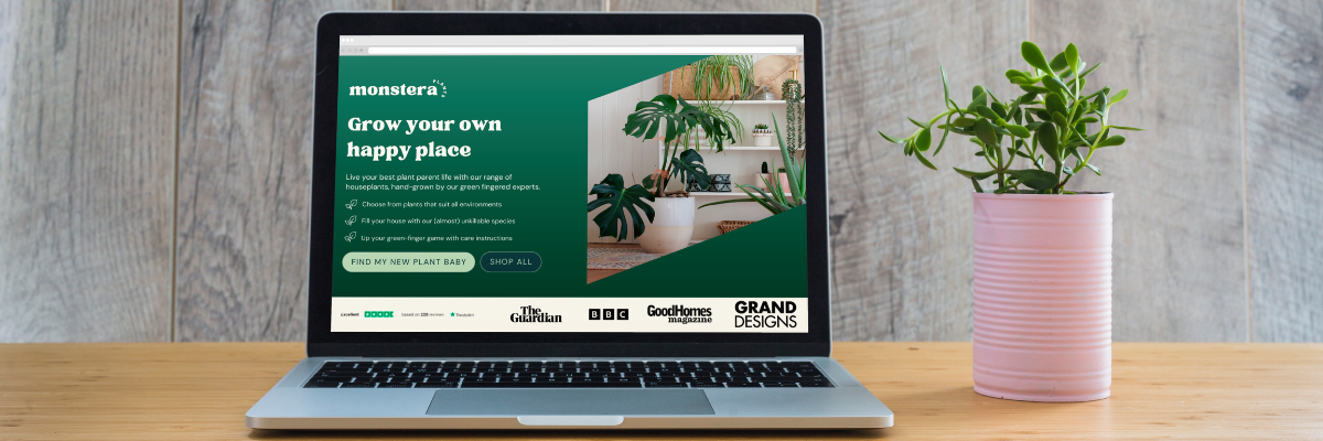
If your traffic is mostly cold: lean toward an awareness-building approach highlighting your main value proposition (think of it a bit like an elevator pitch), like Happy Tuesdays 👇
Like we said, you can’t expect your customers to be ready to buy as soon as they land on your site. So instead, focus on winning them over enough that they scroll down to the next section or click through to your product pages.
Happy Tuesdays do this with a couple of really clever tricks…
👉 Their h1 isn’t hard-selling, but uses a punchy, benefit-led hook. Ravers are used to feeling rough for a few days after they party, so the hook that this doesn’t have to be the case anymore is super eyeball-grabbing (yep, that’s a technical term). Plus, in just 4 words they manage to nail those “oh damn, I want that. I’ll stick around” signals. (It’s also emotionally heightened, which is a technique we’ll touch on later.)
👉 They’re speaking directly to one audience, not everyone. (We spoke about this on Instagram last week.) Instead of trying to appeal to everyone who maybe has a heavy night every now and again, they’re speaking solely and exclusively to ravers. And by doing so, they’re screaming “we’re the brand for you” at the top of their lungs. (Which is smart, because this leads to “stronger purchase intentions”, according to behavioural science.)
👉 They use product copy to act as part of their elevator pitch. Because we know customers read in an F pattern, they’re more likely to read the copy on the product image than the subhead. Knowing this, they’ve cleverly used the product packaging to explain what they do and why ravers should buy it.
However, if your traffic is mostly warm – i.e, you’re a well-known brand that people already know and get – then you can probably move away from the elevator pitch approach.
In that case, you can do something like Bloom & Wild 👇
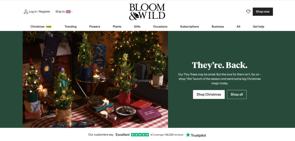
Because their customers are already familiar with the brand and their value proposition – Bloom & Wild did a massive £118 million in revenue last year – they don’t need to introduce themselves or jump into benefits, they can start selling straight away.
And to do that, they use some clever tricks:
👉 The headline (They’re. Back. instead of They’re back) grabs attention by being structurally distinct from other ecomm headlines. By breaking the mold with their syntax, they’re using the psychological principle of salience, which basically means that we pay more attention to things that break patterns or stand out from the norm.
👉 In two words, they’re also building hype around their Christmas products. The full stop formatting builds some drama and anticipation, giving the headline way more emotional weight than it would as one sentence.
👉 They’re also building in social proof and hype. The headline suggests that people have been waiting ages for these products and then the subhead doubles down on it by saying “Our trees may be small, but the love for them isn’t.” That doesn’t just sell the products, it also screams “our customers love us, you will too” to any new visitors that land there cold.
Even when you’re an established store, it’s important to still build a sense of excitement and trust in your brand not just for any new customers that might land on your store cold, but for returning customers too. And as you can see from Bloom & Wild, all it takes is a few words to remind them why they loved you in the first place.
#2: Use your subhead to dig deeper into your main message, like Jude
When you’re writing a hero section, it’s incredibly tempting to try and write a headline that does everything. You agonise over making sure that every word in the headline paints the fullest picture of your brand and your offering.
But — as we saw with Bloom and Wild — that’s not really the headline’s job.
Your headline’s only job is to make sure they keep reading. Then your subcopy can come in and be like “Sound good? Here’s how we do it.”
Jude, the taboo-breaking bladder care brand, is a real lesson in not trying to make your headline do all of the heavy lifting 👇
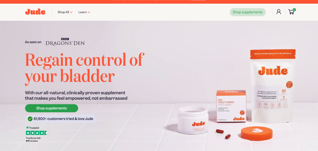
Their headline is really strong – studies show that health messaging that plays on the customers’ sense of losing their autonomy is incredibly powerful and effective – but it doesn’t go for the sale at all. It doesn’t even talk about their product, it’s all about the benefits for their customers.
(Love that.)
But what it does do really well is get the customers’ attention enough to read on to the next line.
And that’s where they flesh out their full value proposition.
👉 They address the customers’ natural skepticism over their bold claims by saying “clinically-proven”. (But this could be better. More on that in a sec.)
👉 They emphasise the “all-natural” to speak to health-conscious buyers looking for non-synthetic or non-medical solutions to their pain points.
👉 They tie their product to an emotion (empowerment) while also showing that they really understand their customers. (“Feel empowered, not embarrassed.”) This uses a technique called emotional heightening, where you tie your product to the way your customers want to feel compared to how they feel now. It’s super effective, boosting purchase intent by up to 70% and doubling engagement.
And yet, while this section is already pretty great, it could still be punched up to be even better.
For starters, down the page we see this trust-building section:
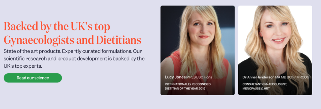
Instead of using “clinically-proven” – a term which is pretty overused and vague, especially in the healthcare space – Jude could add some proper heft to their subcopy by drawing attention to the experts on their team.
🧠 Robert Cialdini – the GOAT of consumer psychology and behavioural science – noted that substantiated claims from experts make us significantly more likely to buy thanks to something called authority bias. Basically, we trust experts more than brands. Shocking, right?
Look what a difference it makes 👇
Backed by top UK gynaecologists and dietitians, our all-natural supplement makes you feel empowered, not embarrassed.
Much better, right? You already feel like you know the supplements are going to help you.
However, we can still make it better.
One of the big mistakes brands make when writing a website is to assume that customers read it like a novel, sentence-by-sentence. (After all, that’s how you write it.)
Unfortunately, that is never the case.
We actually read websites more like magpies, scanning around for a shiny piece of copy that piques our fancy.
As such, it’s bad form to write sentences that rely on another headline or sentence to be understood. (Jude does in their subcopy. That subhead only makes complete sense if you read it immediately after the headline.)
Instead, if they flipped their subhead to lead with the emotional approach and then backed it up with the proof, it becomes much better.
Feel empowered, not embarrassed with our all-natural bladder supplements, backed by top UK gynaecologists and dietitians.
This sentence works much better in isolation, and also flows better from the headline, taking that idea of regaining control and reworking it to flow into their proof.
(We added in bladder too, just to make it crystal clear.)
Boom. 30 seconds of tweaking and you’ve got yourself a pretty great subhead.
#3 — Make your heroes easy to skim like Impossibrew
At DWG, we’re huge advocates of using bullet points in your hero sections.
Why? Because they work with how our brains work, not against it.
👉 They improve readability and engagement. Our brains are naturally lazy. If we see a paragraph of text, chances are we’re going to skip it. If we see it broken down into chunks, we’ll pay attention. (A study published in the Journal of Computer-Mediated Communication found that well-structured content significantly improves user engagement.)
👉 They boost conversions. Research by HubSpot found that simplifying content with bullet points can increase conversion rates by up to 12%
👉 They improve retention. Research also shows that well-structured elements like bullet points increase the likelihood of users focusing on and remembering your key USPs.
And Impossibrew are a perfect example of how to use them effectively 👇️
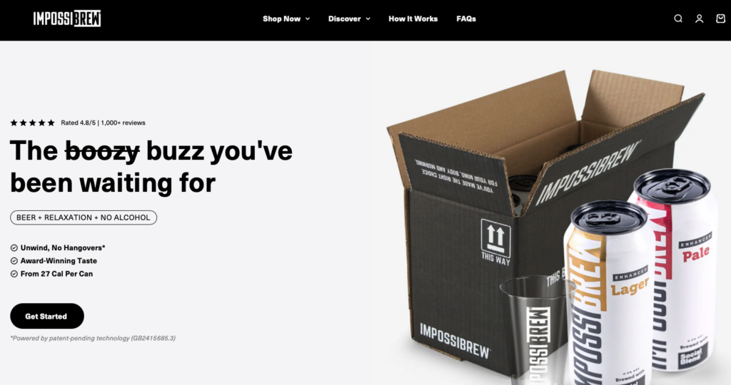
- Leading with a benefit of “no hangovers”? ✅
- Adding in some doubt-killing social proof with “award-winning”? ✅
- Speaking to customers wanting to cut down on beer for health reasons? ✅
But again, if we’re being picky, Impossibrew could make these bullets even stronger by using a copywriting technique called parallel structure.
📖 Lingo lowdown: Parallel structure is basically when all bullet points are formatted in a similar manner to make them easier to parse and understand.
In Impossibrew’s bullets, we have a benefit, an accolade and a fact in 3 different bullets which is great, but they’re all presented differently. And because we have to process each bullet separately rather than as one thematic list, they leave the customer to connect the dots themselves rather than showing them the benefits.
However, if they tweaked them to say something like:
- Unwind with no worries about tomorrow’s hangover.
- Kick back with our award-winning flavours
- Make healthier choices with our 27 cal beers
👆️ Now, because they’re formatted in a benefit/proof structure, we can skim that list and understand it in a fraction of the time.
And because we can understand it quicker, it’s easier to spot and remember key messages of chilling out and making healthier choices, two of Impossibrew’s key USPs.
#4 — Use social proof to boost trust in your brand like Grind
We’re not going to bore you by going into how important social proof is. You already know that customer reviews, PR coverage, etc… all helps legitimize your brand, build trust and, ultimately, sell more stuff.
And by sell more stuff, we mean shit loads more stuff. The Spiegel Research Center found that displaying reviews for your products can increase conversion rates by a whopping 270%.
(👋 If you want to read up on the stats and stuff behind this, we covered it last week in our article about microcopy.)
What’s clever about Grind is how they’ve got two kinds of social proof into the “above the fold” of their website 👇
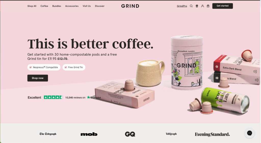
That means that as soon as you land on their site, before you even skim the copy, you’re hit with multiple “you can trust us” signals in the form of the Trustpilot widget and the splash of PR logos.
But there are also a few more clever things going on here too that we want to dig into:
👉 The social proof allows them to go bolder with their messaging. Rather than opening with a benefit-led headline – Meet a better cup of coffee, for example – they pitch their headline super bold with almost a mission statement of This is better coffee.
Now, ordinarily, that headline would fall flat on its face. It should read like brand peacocking BS.
But the social proof creates an invisible second headline of “And all of these people agree with us.” that makes the headline land much better.
👉 They use an imperfect Trustpilot score to build trust in the trust. Customers are wary of misleading bullshit to get them to buy. They know it’s very easy for brands to highlight (or even fake) a few 5-star reviews to convince them to open their wallets.
Showing your customers the warts and all impressions of your brand – even the few less-than-positive reviews – helps build trust and set expectations for a better brand experience.
(And when consumers aren’t expecting perfection, they are less likely to experience disappointment if their package turns up a bit beaten up by the postie, in turn leading to higher satisfaction post-purchase. Which means better reviews, which leads to more sales, and so on and so on…)
#5 – Make your products feel personalised like Loop Earplugs
We’ll be honest, most of your customers aren’t likely to click the buy button in your header. (At least not on their first visit, the second time they visit, they’re more likely to.)
👆️ That doesn’t mean you don’t need a CTA. Even if they don’t click it, having a CTA sets expectations of what the end goal is for the user – i.e, I can buy the stuff I need here – and matches their expectations for an ecommerce site. Not having one looks weird and sets off alarm bells.
However, if you’re clever with the CTA, you can earn that click, guide them to a product that suits them and make it more likely that they follow through with a purchase, even on their first visit.
Let’s take a look at how Loop make it more likely you’ll click the buttons in their header and continue on your customer journey 👇
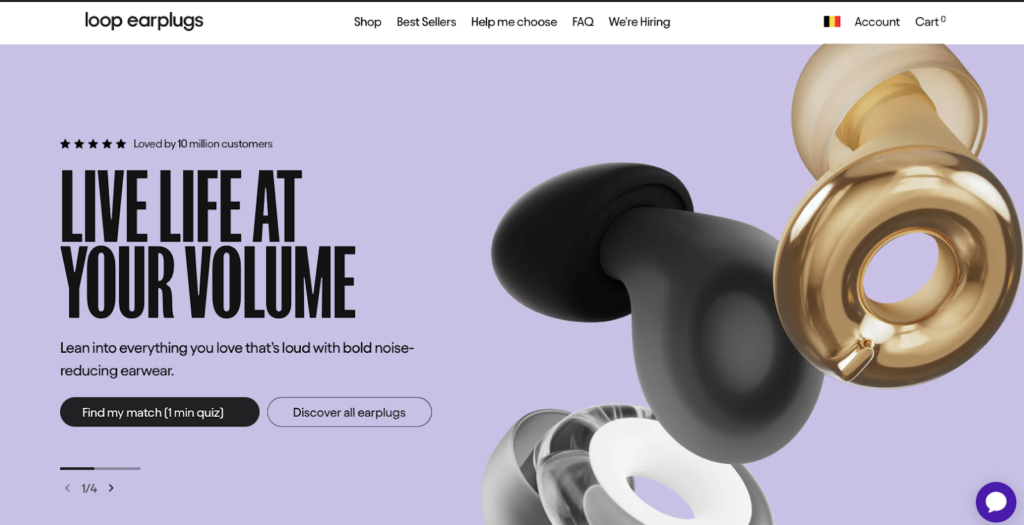
With their primary CTA, Loop gives the customer the choice to find their perfect earplugs.
This is really clever.
Studies show that personalized experiences increase conversions. In fact, 80% of your customers are more likely to purchase if you offer them a personalized shopping experience.
And to guide their customers towards that 80%-more-likely-to-buy path, Loop uses a really clever 6 word CTA – Find my match (1 min quiz) – that manages to:
- Shift the focus from selling to helping. By emphasising personalization, Loop reduces cognitive effort, and creates an exploratory, customer-first experience.
- Prevent decision fatigue in their customers by providing recommendations (rather than making them sort through all the products)
- Lower the barrier to clicking the button by showing it only takes 1 min
- Make it more likely the customer will click the button by using “my” instead of “your”.
(👆 Practicing what we preach with parallel structure there.)
But what about customers that don’t want to do the quiz? Maybe hot or warm leads that just want to buy?
Loop covers those bases by adding a secondary CTA (weighted differently and less in-your-face design-wise) to offer an alternative for customers who may not want a quiz but still want to browse.
Smaht.
💡 If your goal with your homepage is to sell one thing or have one outcome – AKA, we want to sell our new coffee machine and nothing else – then multiple CTAs is a bad idea. In that instance, you want to control the user journey and just give them one thing to do all the way down the page.
Putting it all together: a framework for your killer hero section
To help you put these tips to use on your own store, we’ve mocked up a hero section that combines all of the elements you need to create your own winning, attention-grabbing hero section 👇
- Benefit-first headline? ✅
- Subcopy that builds on the headline and establishes trust? ✅
- Skimmable bullets that use parallel structure? ✅
- Personalized CTA with secondary CTA? ✅
- Customer and industry social proof? ✅ and ✅
Get those elements into your hero section – even if they’re not perfect – and you’ll have your customers scrolling, exploring, and adding to their carts quicker than you can say “there really isn’t a scientific consensus on the human attention span, but we know that customers don’t hang around very long if something doesn’t interest them.”