Tiny words, big wins: 5 microcopy tweaks and fixes that will boost your sales.
Microcopy is the unsung hero of your ecommerce site. Here are 5 ways you can use microcopy to make more sales and keep your customers engaged.

Every brand we’ve ever worked with has obsessed – quite rightfully – over nailing the perfect tagline, creating the perfect product images, and having a kick-ass website.
And that stuff is super important, don’t get us wrong.
(We wouldn’t have jobs if it wasn’t.)
But here’s the kicker: the tiny bits of microcopy on your site might just be the real MVP when it comes to boosting conversions and making more sales.
In fact, some of the copy on your website that can have the biggest impact on user experience – AKA, how easy it is for customers to spend money – you probably aren’t even thinking of as “copy” at all.
We’re talking about:
👉 Buttons
👉 Navigation and labels
👉 Form instructions and placeholders
👉 Error messages
👉 Security and trust assurances
In fact, most of the time, these super-important bits of copy are usually left to either the designer, the developer or the out-of-the-box e-comm software to figure out.
💡 Want to see what a difference it can make?
Imagine this: you’re one click away from ordering a new product that you really want. You’re fully sold. Then their checkout asks for a few details that make you question why they really need them (my phone number, why? Will I get spammed?) and then BAM, you’re hit with a “Payment error D124533 occurred.” message.
Do you try again? Or do you close the tab faster than you can say abandoned cart?
👆 That’s the impact that microcopy can make to your customers’ journeys.
Writing microcopy is kind of like the anti-copy copywriting. You’re not trying to get them to buy, you’re trying to get them to not not buy.
And while there are hundreds of clever ways you can use microcopy on your ecommerce site to keep people engaged and ready-to-buy, we thought we’d break down 5 quick microcopy wins you can add to your store today to start making a difference to your conversion rate.
#1 —Turning a click into a close: turning calls to action into calls to value
We’ll start with the most obvious piece of microcopy on your site: buttons.
Now, your run of the mill buttons – Buy Now, Learn More, Get Started – all have a time and a place, but they’re also incredibly utilitarian and final. They require your customers to be fully sold on taking the next step before they click.
However, if you strategically swap them out for a call to value (CTV) then some magic happens.
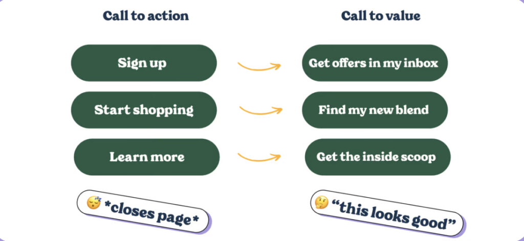
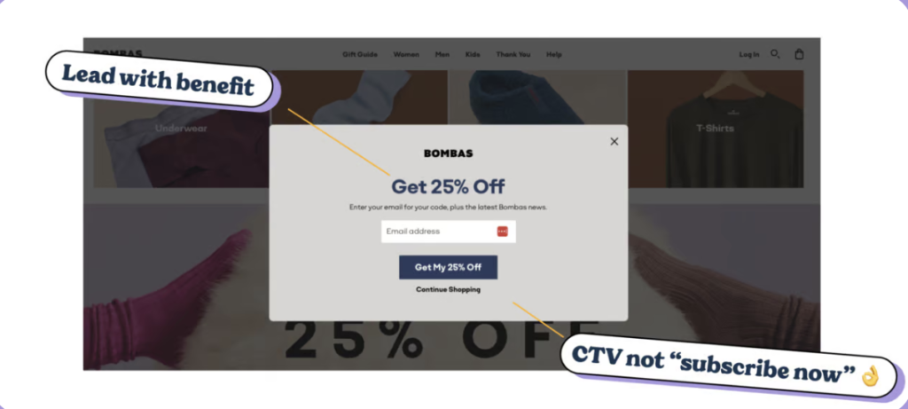
Look at how Bombas – who have sold $1.3 b of products since launching about a decade ago – use “Get My 25% Off” in place of the bog-standard “Subscribe” here to overcome any hesitations the user might have about giving over their email address.
Using my in buttons vs your is also huge. Unbounce reported a 90% uptick in conversions when they switched buttons from “Get your discount” to “Get my discount”.
Why does this work?
For starters, studies by Nielsen Norman Group reveal that users are more likely to convert when CTAs clearly outline benefits.
In fact, buttons with a clear value proposition increased conversions by up to 161% compared to generic CTAs.
But there’s a bit of nuance to it…
It’s not as simple as turning every button into a value-based button.
Instead, it’s a matter of following the user journey from interested to motivated to purchase to fully sold.
As you go along that line, you’ll want to slowly morph your CTVs into your more classic CTAs to switch from selling the benefits your customers to giving them crystal clear guidance on how to check out.
🧠 Quick rule of thumb: the more impulse purchase-able your product, the less you’ll need to use CTVs because users are buying on impulse and are already primed to buy. However, for things like subscriptions and more high-value purchases, you’ll need more CTVs at the top of the funnel and more CTAs at the credit-card-in-hand stage.
#2 — Help your users find what they want to buy quicker: the power of labels and navigation
If you sell lots of products – hell, even if you sell as little as 5 products – then your store runs the risk of putting customers into a state of Choice Overload.
Essentially, our working brains can only really retain enough info to make a proper decision for an absolute max of 9 items. So if we’re presented with more, we freeze up and decide to go away and think about it more. (And that’s obviously not what we want your customers to do.)
🧠 Iyengar and Lepper did a study in 2000 that demonstrated that when shoppers were shown a selection of 24 jams, they were less likely to purchase than when they were shown only 6 different jams.
By having less to choose from, customers avoided feeling overwhelmed and were more able to decide which of the 6 jams they prefer. 24 jams was just too many that it short-circuits the brain (as much as eating 24 jars of jam might sound like the perfect Sunday).
Now, obviously, you probably aren’t going to reduce the number of items you sell down to just 6 options.
But you can use microcopy to help customers quickly sort their options down to a much smaller number.
Check this out from Simba Mattresses 👇
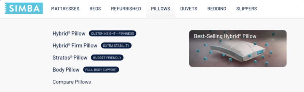
And this 👇
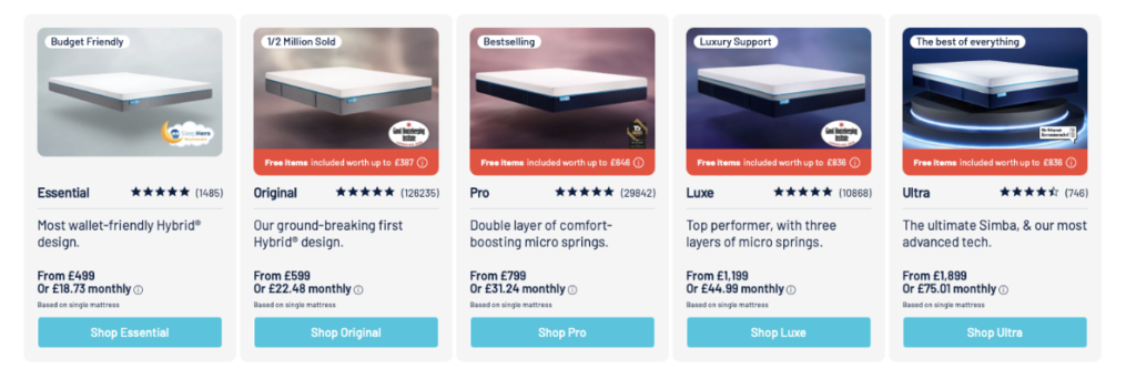
Because all their products look the same and have relatively standard names, Simba have done something really clever by using microcopy to help users self-segment based on their needs, preferences, and pain points.
On a budget? Go with the essential mattress.
Need support? Go with the Luxe.
Just want the best one? Go with Ultra.
(Plus, the other two use social proof, which we’ll get to later…)
What does this do? Well, it turns their menu and overview pages from just navigation tools into opportunities to help the customer through a clear and frictionless decision-making process that gets them to a stage of “I know this is the product for me” before they land on the product page.
Wicked smaht.
#3 —Help more customers check out: use little nudges to prevent abandoned carts
We’ve never met a brand that doesn’t think their checkout process can convert better.
And, to be fair, they’re right. According to Statista, global checkout abandonment rates are 70.9% and climb to a massive 80.2% on mobile. 🤯
And while we’re never going to promise that you’ll create a checkout that converts everybody into a customer, a few pieces of clever copy can make a huge impact on your conversion rate.
And to show you this works: we recently helped a client tweak the microcopy in their checkout process and nearly tripled their conversion rate. (Technically it was a 2.7X improvement, but still.)
Like with all pieces of microcopy, the key is empathy for the customer and where they’re at.
A lot of brands make checkout decisions from the inside out. We need to collect phone numbers, email addresses, your mother’s hamster’s name… to fulfill this order…
But for customers – especially the younger customers that are inherently skeptical about their data security – this can feel like an extra cost of checking out.
🧠 Consumer psychology 101: checking out
👉 The Pain of Paying is real: Ever really wanted something and then got to the checkout and changed your mind? That’s the pain of paying. Every click that moves a customer closer to parting with their money can trigger discomfort. And that’s just the table stakes for online shopping.
👉 Customers will abandon carts to protect their personal data: a 2023 study by Pew Research Center found that 79% of consumers are concerned about how companies use their personal data. Customers are wary of sharing phone numbers, email addresses, and other sensitive details unless they know exactly how it will be used. And even then, adding these details can feel like an additional cost, a bit like unexpected shipping fees.
Now, the first step to optimising your checkout is actually not about copy at all. It’s about minimising what information you collect.
Today’s shoppers expect data minimisation (AKA they want to share the absolute bare bloody minimum required to complete a purchase). In fact, according to Baymard Institute, simplifying forms and only asking for essential information can reduce cart abandonment by up to 18%.
Once you’ve trimmed the fat on your checkout, microcopy can come in and smooth over the rough edges with just a few strategic pieces of microcopy. 👇️
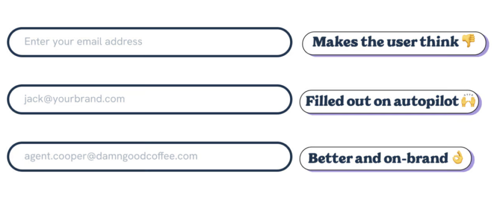
🧠 Use examples instead of boilerplate placeholder
Instead of “enter your email here” put “jack@yourbrand.com” to let users automatically know what information to enter by example rather than by reading. (Research by Baymard Institute indicates that placeholder text with examples improves form completion rates by up to 20%.)
Even better, have a bit of fun with it. Brand your examples to be something to do with your brand (caffeineaddict@javajavajavajava.com) or add in a reference to an on-brand tv show (agent.cooper@damngoodcoffee.com).
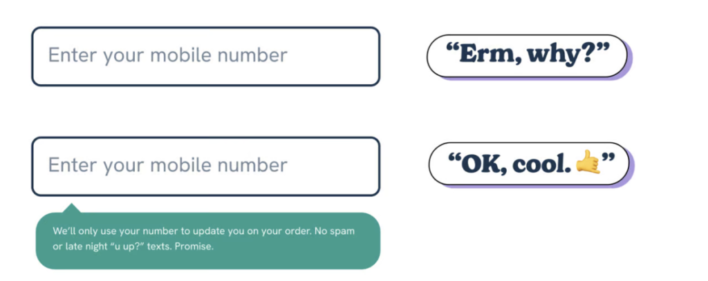
🧠 Tell customers why you’re collecting information
If you need to collect information beyond the bare minimum – say a mobile number – then there are two microcopy tricks you can use to help ease friction.
- Explain why you need to collect the information – this uses the reciprocity effect, where we’re more likely to do something if we’re told why we need to do it.
- Alleviate any concerns about how you’ll use the information with firm language and some humour – adding something like “we’ll only use it to update you on your order. No spam or late night “u up?” texts. Promise.” massively improves the chances somebody will fill it in without bouncing.
#4 — Keeping users onboard when things go wrong: nailing your error messages
At some point, your customers are going to mess up when they’re filling out your checkout form.
(If you’re anything like us, you’re usually trying to juggle two other tasks – or watch the next episode of Bad Sisters – when you’re shopping online. And that always leads to me typing my name as Havk Barxlat.)
👆 That’s where error messages come into their own.
(Note: this is usually a task handled by the developer not the copywriter, so we see so many brands getting this wrong.)
Here’s why error messages make such a big difference to conversion 👇
Confusing error messages = lost sales: Ever filled in a form and then got a vague error message like “Invalid information”? Annoying, isn’t it? Leaving your customers in the dark on how to fix the situation leads to frustration and cart abandonment.
Blaming the user = lost sales: Error messages that feel accusatory (like “You did something wrong!”) do two things: 1) piss the user off and damage your brand’s relationship with them. 2) You validate the inherent idea that “this checkout is too complicated, I’m gonna dip”. Both of them are going to stuff up your sale.
No clear next steps = lost sales: When users don’t know how to resolve an issue, they’re more likely to give up. For example, “Incorrect address” doesn’t tell the user why their address is invalid or how to fix it.
Instead, here’s how to fix those conversion-killers with just a few words 👇
Be clear and specific with your error messages: Don’t just give some random error code, explain what caused the error in the first place.
❌: Invalid input.
✅ The credit card number you entered looks too short. Please enter all 16 digits.
Be friendly and use passive language: Here’s a good example of when to break the “always write in the active voice” rule you’ve heard a million times. In error messages, use empathetic but passive language that reassures the user rather than foists the blame onto them and makes them feel stupid.
❌ “Invalid email.”
✅ “That email format doesn’t look quite right. Please use a format like name@example.com.”
Make your error messages actionable: think of error messages like the best teacher you had at school. They didn’t just write “wrong!” in the margins. They did something like “Try this next time…”
❌ “Address not recognised.”
✅ “We couldn’t find that address. Can you double-check the street name and zip code to make sure they’re correct?”
#5 — Build trust: use clever pieces of microcopy to send those trust signals
When users see a button asking for their credit card info, they’re going to make a split-second micro-calculation: “Can I trust this brand and this website?”
And unfortunately for us, trust isn’t just a one-and-done, whack TrustPilot widget up and call it a day task. There are different kinds of trust and social proof you need to dot around your site.
👉 Add in social proof microcopy near calls to action: near a CTA, add some social proof along the lines of “trusted by 10,000+ customers” or “Rated ⭐⭐⭐⭐⭐ by 5,000+ customers.” Not only does this help alleviate that split-second of doubt, but it uses the Bandwagon Effect, a cognitive bias where we’re more likely to trust brands that other people trust.
👉 Highlight trust signals in your checkout: the Baymard Institute has found that customers focus on three key things when they’re checking out: security (causes 24% of all abandonments), fulfillment (causes 67% of all abandonments), and refund policies (causes 18% of all abandonments).
Here, microcopy is your best friend (again) 👇
🧠 Add “Shop safely with secure checkout” near the credit card fields to increase trust in the fact that their credit card information is safe. Even better, make sure you have badges and third-party trust signals near these fields too.
🧠 Clearly label your delivery options and give users a choice: if you can, offering free delivery is always going to be a winner (even if it’s above a certain cost “Fast, free shipping on orders over $50”). If not, make guarantees on delivery time (“Delivered in 3-5 business days.”). We live in Amazon Prime’s world now, customers expect fast shipping.
🧠 Add messaging like “Free returns, always” or “Risk-free shopping with 30-day returns.” to alleviate those last-minute hesitations around checking out.
TLDR: Small words, massive impact
Microcopy is more than just filler text or helping when your customers make a mistake, it’s your secret weapon that keeps customers engaged and ready to checkout as they make their way through your site.
It’s copywriting’s unappreciated little brother, doing all the heavy lifting and getting none of the praise.
(👆️Note from Joe: I know that feeling.)
When you nail your microcopy, you’re not just making your site easier to use—you’re building trust, reducing friction, and nudging customers ever closer to that “Buy Now” button.
So, take a closer look at those tiny unsung heroes on your site. They might just be your key to turning more browsers into buyers.
👉️ Optimise your buttons: turn your generic CTAs into Calls to Value to highlight benefits and drive more clicks.
👉️ Simplify navigation: Use microcopy to guide customers through product choices and reduce Choice Overload.
👉️ Streamline your checkout: Collect only essential information and provide clear placeholders to ease privacy concerns and reduce friction.
👉️ Refine error messages: Write friendly, specific, and actionable error messages to help users fix issues without frustration.
👉️ Reassure with trust signals: Add security assurances, social proof, and clear return policies to build customer confidence and reduce cart abandonment.
But most of all, put yourself in your customer’s shoes: Good microcopy is empathetic, first and foremost. So ask yourself: What would you want to see or read at that stage in the journey? Would I feel comfortable doing this, or would I need reassurance? 👈️ that’s the key to microcopy that helps you sell more stuff.