Steal Spacegoods’ PDP messaging & layout trick to make customers say “yes!”
The structure of your PDP matters just as much as the words. Here’s how to organise your copy to match how customers think.

When we’re working on copy projects, one of the issues we see crop up on more pages than not isn’t really about copy or headlines or messaging or voice at all…
…it’s how the information works on the page.
Or, put another way, it’s how lots of brands are presenting information in a way that makes it harder for the customer to make a decision, not easier.
And that’s not a surprise, really.
When you’re writing copy, you’ve got a million little bits of information to organise and arrange and it’s very easy to fall into a trap of “let’s just get it all on the page” rather than “putting it where it belongs”.

(Especially when you have lots of stakeholders involved in the process. Or you’re a younger brand that’s not 100% sure on your messaging yet.)
So, while we’ve touched on this before when we looked at Patagonia and Construal Level Theory, we thought we’d get a bit more granular this week and bring you inside our process for figuring out where information should live on the page.
Full disclosure: it’s not perfect. It’s not going to make a page publish-ready immediately. And you’ll probably need to bend the rules in a few places.
But what it does is help you review your pages and figure out exactly how to organize all of the information on your product page so that you make it easier for customers to say yes to hitting that buy now button.
Let’s get into it 👇
💡 This week’s big idea: how you arrange the information on your page is just as important (if not more important) than how you say it.
We know. We know… two copywriters saying that sometimes the words you choose aren’t the most important part?
We’re getting excommunicated once this goes live.
But the truth is, where we decide to tell customers key pieces of information is a massively overlooked tool in your copywriting toolbox.
Because, honestly, most of the pages we look at have all the ingredients of a good PDP… (strong USPs, reviews, UGC, good descriptions, clear benefits…)
… they just have them in the wrong order.
And that’s a bit like cooking a full Christmas dinner but putting the turkey in the oven for the last 20 mins.
All the good stuff is there, but nobody is going to want to eat it.
Our trick? Group the information on the page by the decision you’re trying to help the customer make or the conclusion you want them to draw.
If the information doesn’t relate directly to that main idea, put it somewhere else.
In other words, treat each section on the page like a chunk with one message, one consistent idea and one takeaway.
Here’s why it works:
Our working memory is tiny. Cognitive psychologists like Nelson Cowan put our working-memory capacity at roughly 3 to 4 “chunks” of information at a time. Every time you make someone jump from thinking ‘is this worth it?’ to ‘oh, they’ve been in GQ’ to ‘oh, is that the returns policy?’ within the same section, they drop half of what they were just thinking about.”
Customers prefer it when information is “chunked” together. Consumer studies have shown people choose faster and with less regret when everything they need for a decision is grouped together rather than having to jump around and read between the lines.
Processing fluency speeds up decisions. When info is neatly grouped together by theme or task, the page feels easier to ‘get’. And there’s good evidence that things that feel easy to process are judged as more believable and trustworthy.
Which means that when you’re in that messy “I’ve got one million things I need to include on this page” mode, the task becomes a lot easier.
You start by listing out all the things customers need to know to make a decision.
Then, you break it down according to the zoomed-out-to-zoomed-in rubric we spoke about a while ago.
And then, from there, you just make sure to group all of the information related to each point together.
No dotting and dabbing tidbits around the page. Instead, stick to a ‘one decision at a time’ rule when you’re mapping out pages.
Think of it like this: if a piece of copy helps with a decision, it belongs next to the other bits that help with that same decision.
Here’s how we do it 👇
How Spacegoods’ product pages are really, really good at letting us focus on one thought at a time
When you look at a brand like Spacegoods from the outside, it’s easy to assume it’s a brand built on going viral and being the trendy new thing.

We mean, in just a couple of years, Spacegoods have gone from zero to 150,000+ customers, broke £4m in revenue in their second year, and were on track to break £10m last year.
But under the hood, there’s another very boring, very unsexy reason (we think) they’re so successful: their product pages make it really easy to a) skim and find the information you need and b) stay focused on only on that bit of information and that decision.
And while influencers and going viral helps, it’s super hard to scale to 7-figures without really putting some work into testing your offer, your messaging, and, most importantly, a good sprinkling of clever information architecture.
And Spacegood’s page (pretty much) nails it.
They don’t give you breadcrumb trails of information. They don’t try and tell you three things in one place.
They keep it super disciplined and focused in every section of their pages.
Look at this 👇
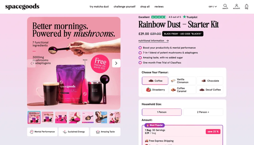
Now, this section might look like a lot of information in one place.
And it kinda is.
But when you look at it, you’re only being presented with the information you need to decide “is this product right for me?”
(☝️ And that’s Job #1 in the customers’ brain when they land on your page.)
As soon as you land on the page, it’s all high level. You know that their product is going to help with mental performance, give you more energy, boost your productivity and come packed with adaptogens and potent mushrooms.
On top of that, you can make high-level “is this worth it?”-style decisions too. You can see the price, you can see the discount, you can see all the free gifts and you can see a quick Trustpilot score overview too.
All that’s before you hit scroll.
But here’s what’s really interesting…
They’re really careful about what they include here so they don’t distract their customers or give them too much to think about.
👉 They sell adaptogenic drinks, yet there’s no talk of what specific adaptogens are in the mixture above the fold. Why? Because that would be zooming in too much. That takes customers out of “is this right for me?” mode and into “how does this work?” mode.
👉 Despite it being a novel and new product, there’s no information on how to make the drink. Because, again, that takes them out of validation mode and into analytical thinking mode. And that belongs down the page.
👉 Despite it being a brand that’s built on going viral and getting featured in the press, there’s no UGC or customer reviews or press logos above the fold. Because, again, that distracts the customer from the core job of “is this right for me?”.
Of course, all of that information (and more) comes after the first scroll, because if a customer hasn’t added it to their basket and keeps scrolling, then there’s usually a burning question or two that they haven’t had answered.
That’s when it’s time to go a little deeper.
But Spacegoods handle their deeper dives in two clever ways.
- They use their h2s as quick “if you’re wondering this, check this section out” way markers for their customers. That means that customers can skim the page and find the information they need to get off the fence and hit buy now fast.
- They keep the sections tight and disciplined to only one idea. They don’t try and make all sections do all things all the time.
It’s wicked smaht.
Check this section out 👇
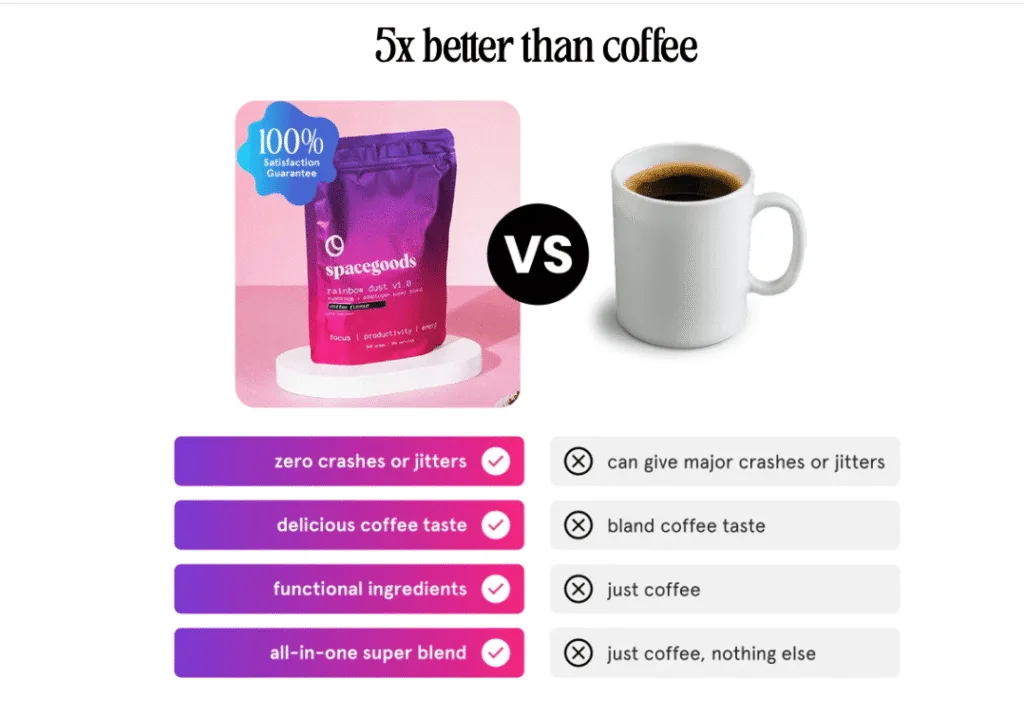
On the surface it’s just your standard “us vs them” section. Loads of brands do that.
But this little section is basically the poster child for what we’re banging on about: it picks one decision and focuses only on making it as easy as possible for the customer.
That’s why this whole chunk is solely dedicated to answering one question: “Should I swap my coffee for Spacegoods?” That’s it. Nothing else.
And every single bit of copy in this chunk is there in service of answering that question and that question only.
- It’s not comparing itself to Red Bull, matcha, other mushroom brands, caffeine pills or any other alternatives. That’s because they know that most people want to replace their coffee, so that’s the headspace they want to speak to.
- It doesn’t talk about free shipping or customer reviews or eco credentials or any of the “why Spacegoods as a brand?” decisions. That has nothing to do with “coffee vs Spacegoods” so it’s saved for another section of the landing page.
- There’s no big health claims or breaking down of the ingredients in the all-in-one super blend. Why? Because that’s not a coffee vs Spacegoods thought process. That’s a “how does this work?” thought process. Coffee doesn’t have adaptogens, Spacegoods does. End of story. And a much simpler thing for customers to remember.
- Then, the small “100% satisfaction guarantee” does just enough to quash any lingering “yeah, but what if…” questions without getting bogged down in the intricacies of “if you don’t like it, send it back within 14 days and…”.
That’s really clever.
Because the more we fill sections with things like ingredient names, dosages, brewing instructions, returns policies… the more it starts to open new tabs in the customers’ brains.
And pretty quickly, we’re writing copy that’s giving customers way too much information and putting them back in “oh man, I need to think about this” mode.
But chunking things up doesn’t just make it easier to skim and understand. It also lets customers find the information they need and say yes quicker because you’re not constantly opening new tabs in their brain.
👋 Erm, don’t all product pages do things like this?
If you’re reading this thinking “huh? This isn’t really an interesting trick at all. Most brands do things like this”, we get it.
In fact, the first time we noticed Spacegoods doing it, we said the same thing. Eh, all brands do that.
And then we went and looked lots of other PDPs.
And on so many we found brands chopping one decision up into lots of little pieces and dotting them around the page.
Instead of one chunk for each decision, we’d find PDPs that did stuff like this:
An h2 that says “No jitters, no crash.”
Tasting notes and “more adaptogens than your afternoon coffee” in a subhead with a “plus, free shipping” below.
An FAQ that says “Can I drink this instead of coffee?”
UGC or a testimonial that says “I swapped this for my morning coffee and feel so much better.”
Now, all of that information is obviously super important and great to include.
And customers need to read it.
But on so many pages, it had been chopped up and split across the page, which meant customers had to:
1.Read the “no jitters, no crash” h2 and start a coffee vs new-thing comparison in their heads.
2. Remember that comparison a couple of scrolls later when they’re skimming the “tastes great/all-in-one blend” bullet points. Then they have to pair that fact with the coffee vs new thing information you gave them as well.
3.They have to remember those things when they hit the FAQ and see “Can I drink this instead of coffee?”
1.Then they have to close the loop if (big if) they read far enough into the reviews to find the one that says “I swapped this for my morning coffee…”
…all while juggling a bunch of other questions like:
👉 How much is it?
👉 What do I actually get in the box?
👉 When will it arrive?
👉 Is it safe for me?
👉 Do I trust this brand?
And when you pair that with the fact that customers don’t really want to read your copy… … it’s no wonder people end up with six mental tabs open, thinking “I’ll come back to this later.”
But all it takes is a little bit of a spring clean and some clever information architecture and you can turn messy landing pages into landing pages that make it so much easier for customers to say yes to your products.
Here’s how 👇
How to use this on your own product pages (without going back to square one)
Whenever we look at a product page, one of the first things we ask ourselves is this:
What decision is the copy trying to help them make here? What question is it answering for them? Is it giving them all the information in one place rather than making them hunt for it?
And for 99% of product pages, those questions are some variation of the big three:
- Is this actually for someone like me? Is this really going to work in my life?
- Is it worth the money? Am I getting a good deal?
- Can I trust this brand and product? What happens if I don’t like it?
So, as you’re working on a product page, don’t think of your task as adding new modules or creating new sections because “we need that information on the page”.
Instead, think of it like trying to make it as easy as possible for someone to finish those three jobs.
Once you’re thinking like that, the rest pretty much takes care of itself.
Our top tip? Give every chunk one job.
As you scroll your own page, stop on each section and ask:
“What’s the one big takeaway we want them to leave this bit with?”
If you can answer in a few words, you’re golden. That chunk has a clear job and it’s pulling its weight in helping someone say yes.
If you catch yourself saying, “Well, it’s sort of about who it’s for and sort of about value and sort of about trust…” …you’ve found a Franken-section.

And while these Franken-sections (Guillermo del Toro, call us) are brilliant for ticking internal boxes – “look, we’ve squeezed everything in here!” – for customers they feel cluttered and confusing.
You’re asking them to think about three different decisions at once, which means they don’t quite finish any of them. Unsurprisingly, that kills momentum.
Luckily, the fix is boringly simple: split the Franken-section into smaller slices, each grouped by the decision you’re helping them make or the question you’re answering.
That’s literally all Spacegoods have done with their “5x better than coffee” block: one slice, one decision.
Do that and you get a page that:
- feels calmer and easier to “get” for real humans, and
- gives search and ad algorithms more clean, on-topic copy to chew on.
All without rewriting a single word of copy.
That’s what we call a win-win.
👋 Pro tip: keep your eye out for split decisions, too.
As you scroll your product page, keep an eye out for any messages that keep popping up again and again. Or bits of related information that are scattered around the page.
For example, if you’re running an offer with a free gift or membership perks or a lifetime discount, make sure you’ve got all of that information near the price.
Don’t open with an offer and then have a free gift at the bottom of the page as a last-minute deal sweetener.
All of those bits of information are part of the same job in the customer’s head: “should I buy this?”. Scattering those details around the page makes that decision harder for them to make, not easier.
However, that doesn’t mean you can’t repeat yourself.
Dotting little reminders around the page like a quote in the reviews, a trust badge lower down the page, Trustpilot scores near CTAs, etc.. is always a great idea.
Just don’t drip-feed new pieces of information that are crucial to a decision all over the page.
Put the full answer in one place, then repeat it and reinforce it elsewhere if you need to.