5 (and a half) ways to improve your copy without changing a single word
Sometimes the biggest impact you can make to your copy isn’t anything to do with the words you choose. It's about making it easier to read.

If you’ve got a product page or a landing page that isn’t converting quite how you’d like, it’s natural to feel like you need to write a new headline, add some more social proof, highlight some more USPs…
And those things are all great.
But more often than not, one of the big reasons that copy isn’t converting is how it’s formatted.
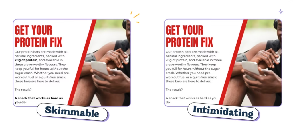
Ever opened a really important letter from your bank only to put it to one side because even just a quick glance was intimidating?
You’re not alone. We all do it. It’s how our brains are wired to work.

Human brains are called cognitive misers for this exact reason: if something looks like hard work, our brains are like “nah, I’m good thanks.”
So when we see copy that looks digestible — short sentences, clear headings and plenty of white space — we stay in that sweet spot of engaging with the words and absorbing the information.
But when it’s dense and unformatted? Not so much.
Check this out👇
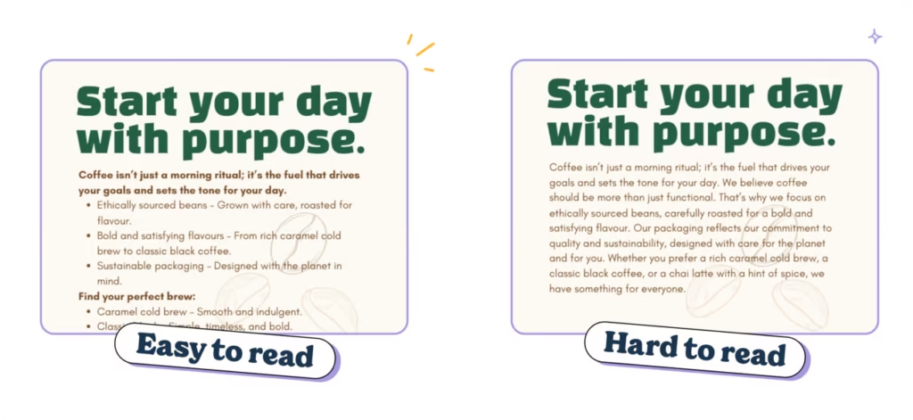
Which one did you read first?
The left one, right? That’s because it looks more accessible.
It looks easier to read.
It looks like it’s going to take less brain power to understand, so our lazy brains are subconsciously drawn to it.
🧠 The science behind why formatting works
Every single one of us — even us professional word nerds — don’t read every word when we land on a website.
We skim, we scroll, we read the easy bits…
If it seems like an intimidating wall of text, we jump ship regardless of how good the writing is. We all do it and it’s because that’s how our brains work 👇
Daniel Kahneman’s Thinking, Fast and Slowshows us why. It comes down to our brains having two systems of thinking:
System 1 — Fast, intuitive thinking
System 2 — Slow, analytical thinking
So when we’re faced with copy that looks easy to read, we use system one. We think on our feet and make intuitive buying decisions. When we see dense chunks of unformatted text, our brains switch to system 2 and get analytical.
It’ll be no surprise that system 1 is waaay better for performance and sales.
And the data backs it up.
Nielsen Norman Group’s famous eyetracking studies show that people consume online content in an F-shaped pattern. Translation? Readers focus on the top and left side of a page, scanning for keywords, headers, and bold text. If your formatting doesn’t cater to that, your masterpiece of copy might as well be invisible.
But it’s not just about how we read, it’s about what we remember.
A study from the University of Saskatchewan found that clear formatting, like bullet points and whitespace, improves comprehension and recall. People don’t just read better-formatted text; they actually remember it.
And it’s not just readers who love formatting, search engines do too. Research from Backlinko shows that pages with clear headings, subheadings, and structured content rank higher in search results. Google rewards user-friendly formatting that helps people find what they’re looking for faster.
So, formatting isn’t just about looking pretty. Structure your words well, and they’ll actually get read, remembered, and ranked.
Win, win, win.
So whether you’re writing product descriptions, landing pages, blogs, emails, weekly copywriting newsletters… the goal is the same: make it easy to read.
Because if it’s not easy to read, people aren’t going to read it. And that’s step one of getting people to buy…
The good news is that with a few easy formatting tricks, you can turn more browsers into buyers without changing a word.
1. Keep your copy short and snappy
Ever tried to read a novel where you’ve cracked the spine and the first chapter is just walls and walls of text?
It’s daunting, right?
Maybe you’ll dive in if you’re really motivated, but most of the time it’s straight back to the loving embrace of Netflix.
(*cough* The copy of The Silmarillion collecting dust on my shelf can attest to that. *cough*)
Websites and marketing copy are no different. In fact, research in consumer psychology consistently demonstrates that customers prefer content that’s easy to skim. They read more, remember more and stay engaged with what you’re saying.
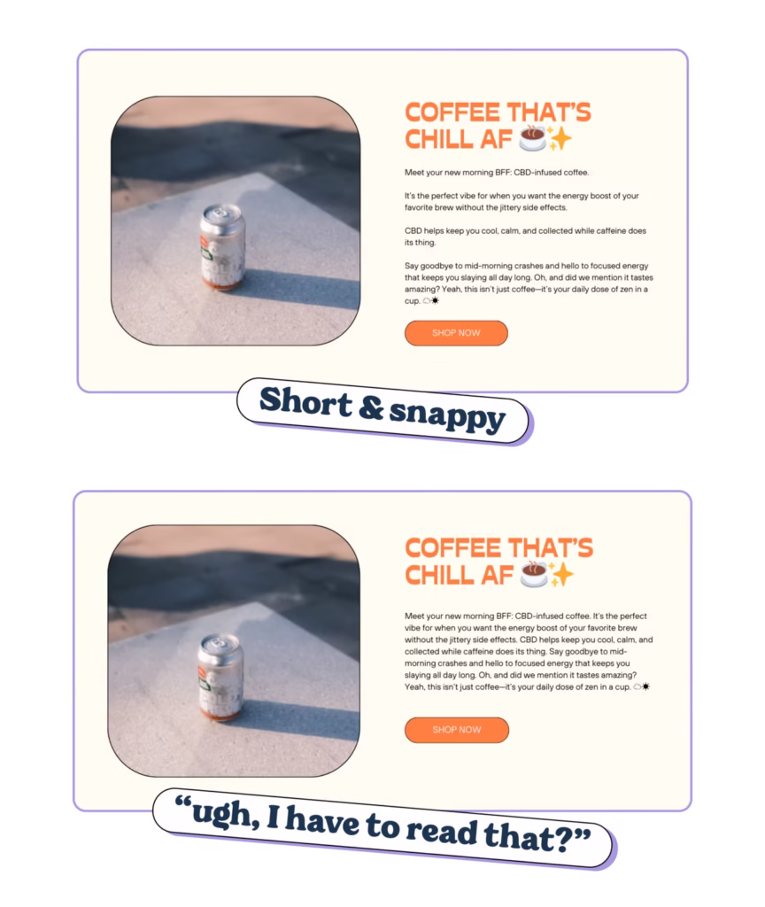
Put this into action 👇
👉 Aim for paragraphs of 90 words or less. According to a study by SEMrush, any paragraph longer than 90 words is going to get ignored by customers. So keep things short and snappy.
👉 Embrace the line break: Got a longer sentence that feels important? Give it room to breathe by dropping it onto its own white line. (This also adds white space, which customers love.)
👉 Write like a LinkedIn bro: add short sentences between your longer paragraphs to make it look more digestible at a glance. (Gloating about your 4am 10K followed by journaling and goal setting before going in to crush your goals is entirely optional.)
👉 Proofread like a skimmer: When you’re reading your copy, do the first read-through as a skimmer. Just take a cursory glance at the copy and see what catches your eye. Does it feel like “ugh, I have to read that?”. If so, break it up some more.
2. Use headlines to guide skimmers through your page
Headlines are always the hardest pieces of copy to write because they have to do so goddamn much. And usually in only a few words, too.
They have to sell and build your brand, obvs.
But they also have to guide the skimmers through your website and show them where to find the information they’re looking for.
🧠 Headers help skimmers retain more information
An eye-tracking study by TheLadders tested whether headlines and formatting improved the recall and attention-span of recruiters reading resumes. They gave time-pressed recruiters some resumes that were formatted as a wall of text and some that had clear headers and sections.
The result? The recruiters spent far more time on resumes with clear section titles and headers and ignored the others.
Top tip: treat headlines a bit like a TLDR for each section
As your customer scrolls down the page, use your headlines to summarize the key takeaway from each section.
That way, even if they skim from top to bottom and don’t stop to read, you’ve conveyed your main message and given yourself the best possible chance to get them reading (and eventually buying).
Like this 👇
❌ About us – generic and overplayed. Not going to stop the scroll.
✅ On a mission to make coffee slavery-free. Gives the reader a tidbit of information to make them stop and read. (Or just remember you.)
❌ Why you’ll love our pasta – requires the reader to stop and read to get the context but doesn’t spark enough curiosity to stop the scroll.
✅ Why 1M+ customers that love our pasta – uses the Bandwagon Effect to build trust in your brand. Even if they don’t stop to read any more, they know that people love your pasta AND that a million customers can’t be wrong.
TLDR: Headers aren’t the roadsigns of your website, they’re the Sparknotes.
A reader should be able to skim your page top-to-bottom and get a sense of all your key messaging without really stopping to read.
Note: This advice doesn’t apply to your hero section. Those headlines have to work a bit harder.
3. Discourse markers are a silver bullet for readability
Honestly, if there’s one thing you take away from this article it should be this: bullet points are fucking great.
Those little dots are basically big, flashing hits of dopamine that scream “hey, I’m super easy to read. Check me out!” to our lazy brains.
🧠 The numbers don’t lie
👉 Bullets boost conversions. Research by HubSpot found that simplifying content with bullet points can increase conversion rates by up to 12%.
👉 Bullets improve retention. Research also shows that well-structured elements like bullet points increase the likelihood of users focusing on and remembering your key USPs.
How to nail your bullets:
- Start with a verb or benefit: Make sure every bullet point is talking to the customer, not about your product.
- Keep them snappy: bullet points lose all power if they’re longer than a few lines. Then they’re just paragraphs in disguise.
- Use parallel structure: parallel structure is when all bullet points are formatted the same way make them easier to parse and understand.
4. Make the important stuff stand out with bold, italic and underlined text
Headers and bullet points are the big guns for making your messaging stand out. Alas, you can’t use them all over the place otherwise they stop being effective.
That’s where bold, italic and underlined text (or typographic styles) come into their own.
Clever uses of bolding, for example, can make key information stand out and help your customers zero in on what matters most, quickly.
It works because our brains love shortcuts and our eyes are drawn to contrast.
🧠 Research by the Nielsen Norman Group (the same legends who discovered how we read in the F-pattern online) shows that highlighting key phrases with bold text makes content way easier to read and helps us remember the information even if we’re skimming (which we all do)
When you bold, italicise or underline text, it breaks up the monotony of paragraphs (even short ones) and makes it easier for us to get the information we’re looking for 👇
But it only works if you use it strategically.
Too much bold, italicised or underlined text (or all three at once 😳) and your copy will look like those dodgy emails in your spam folder or our MySpace profiles from 2005.
Here’s how you can nail it 👇
Highlight your CTAs and key benefits in bold or italics. Rather than highlighting features, highlight benefits so that the customer instantly spots your selling points.
Keep it subtle with one or maybe two bolded phrases per section. Less is more.
Avoid going OTT. A page full of bold, italic, and underlined isn’t just going to look ugly AF, but becomes a bit Boy Who Cried Wolf. If everything is important, nothing is important.
Pro tip: Highlight benefits, not features. Example: “This fabric feels like cashmere but costs half as much.”
5. Try to stick to sentence case everywhere
If you’ve ever written an academic essay, you’ll know how much of a headache using a specific title style can be.
Every headline you write becomes a bit of a chore: double-checking capitalisation, fixing inconsistencies, and generally thinking more about the formatting than what you’re actually saying.
But not only does it waste time, it makes the copy waaay harder to read.
After we’ve learned to read, we don’t actually read words. Instead, we recognise the shape of the word from a quick glance, which lets us skim and understand things quickly.
As writers, we don’t want people to have to stop and actively read our writing. We want our audience to recognise the ‘shape’ of the word and understand it immediately. Why? Because it’s faster, simpler and keeps them engaged.
However, randomly capitalising words — like Annual Percentage Rate or using Title Case (Where You Write Like This) — can make a sentence 13% to 18% harder for our audience to read.
On top of that, studies from Uxxify show that sentence case leads to faster reading speeds and causes fewer regression eye movements, meaning readers pause and backtrack less often.
It’s that fast thinking and slow thinking idea again.
Sentence case lets your customers read it on an intuitive level, title case screams “this is serious, important stuff that requires proper attention” and sends them into analytical mode. 👇
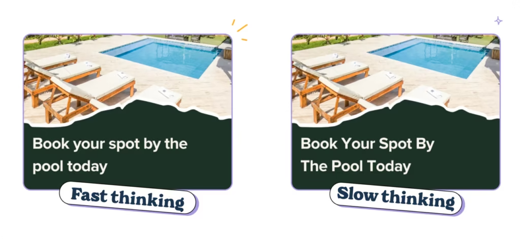
👉 It’s how we naturally read and write. Sentence case mirrors everyday language, so it feels approachable and intuitive.
👉 It’s faster to process. Title case makes your brain pause to interpret each word, which slows readers down—bad news when attention spans are razor-thin.
👉 It’s modern. Sentence case gives your copy a clean, contemporary look that’s a way better fit for modern brands.
The best bit about sentence case? When you’re writing, you don’t need to overthink. Capitalise the first word and move on. It’s a win-win for you and your customers.
5½. Use AI to help you improve your formatting
It’s not always easy to spot opportunities to improve the formatting of your copy. When you’ve written it and know it backwards, it’s tricky to work out which bits your customers will read and what they’ll skip over.
If you’re part of a team, it’s always a good shout to get them to give it a quick read and see what they think but AI can be a big help too.
(Especially as you can keep going back and forth with AI and it doesn’t get annoyed by your badgering.)
👉 It spots what you miss. Let’s face it: after staring at your copy for hours, you’re too close to it. AI can highlight where you’ve got text walls, missing headings, or an opportunity to add emphasis.
👉 It saves time. No more manual tweaking. AI tools can reformat long paragraphs, suggest bullet points, and even restructure your copy to make it easier to skim. Then you can just do some minor edits to make it on brand.
👉 It keeps you consistent. From header styles to bolded benefits, AI helps ensure your formatting is clean and cohesive.
Use this prompt to get you started 👇
Review this copy [insert URL or upload PDF/Doc] for readability and skimmability and provide a list of specific improvements I can make. Look for opportunities to: Shorten sentences and paragraphs Make headings more clear Break down dense text into bullet points or lists Bold or italicise key takeaways and benefits Reformat long sentences to make them more digestible. Obviously, you know your brand and customers better than AI ever will, so take the feedback with a pinch of salt. However, it’s a really good way to get some objective feedback and spot some quick wins that make a big difference.
(We do this on all of our first drafts.)
TLDR: When you’ve laboured over your copy, the best thing you can do is to make sure you’re giving it the best chance to be read. It’s like that old copywriting adage: “the best headline is the one that gets read”.
So be rabid about readability. Sweat the small details. Go to bat for not using Title Case in headlines.
Oh, and if you’re ever in doubt, run your copy through the Hemingway App to check for readability. Aim for a grade 8 or below and you’ll be set.